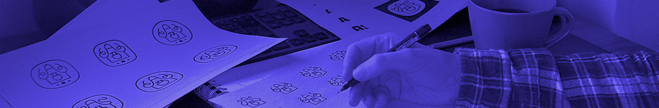
I’ve been spending a lot of time recently working on a set of small symbols for a project that, for now, mostly exists as sketches, tests, and half-finished ideas. Nothing public yet. Nothing fully resolved. Just a lot of quiet exploration and refinement.
From the outside, it probably looks like overthinking. From the inside, it’s that familiar stage of the process where you’re zoomed right in, nudging shapes by tiny amounts, testing relationships, and asking whether a mark still communicates the right thing when stripped of it’s supporting context.
It’s also the moment where something that felt solid an hour ago suddenly looks wrong, or worse, accidentally expressive in ways you never intended. I’ve spent a decent amount of my time on this project trying to craft a face in the icon; unfortunately, the results have been creepy, borderline evil.
This is the unglamorous part of logo design. It rarely features in presentations or portfolios. Yet it is where lot of the significant decisions are made.
Open to (mis)interpretation
A logo can be interpreted, and misinterpreted, once it is launched. It needs to speak to a broad range of demographics, a cross section of people with different experiences and expectations. And with different ways of looking at the world.
This is why so much time is spent interrogating small things. Why a curve is softened or a gap is widened. Why symmetry is avoided, or leaned into. These are not purely decorative choices. They are decisions about tone and meaning, even when they are difficult to justify verbally.
Much of this knowledge is experiential. It comes from repetition, from seeing how marks behave once released into the world, and from recognising familiar warning signs before they fully form.
The work no one applauds
There is a strange contradiction at the heart of good logo design. The better it is, the less visible the effort becomes.
Discarded concepts never appear. Near misses are forgotten. This can make the work feel deceptively straightforward, even to designers looking back at their own projects.
Internally, the process rarely feels clean. It involves doubt, second-guessing, and moments of frustration when intuition and logic pull in different directions. Knowing which voice to trust is part of the job, and not something that can be automated or rushed.
This is also where professional responsibility creeps in. A logo is not a personal sketch. Once released, it represents other people, other ambitions, and other risks. That weight requires close attention to detail, whether we enjoy it or not.
The rabbit hole
It is easy to stay zoomed in for too long. To keep refining because refinement feels productive. To mistake control for progress. Designers are particularly susceptible to this, especially when uncertainty is present elsewhere in the project.
At a certain point, detail work can become a form of procrastination, or a way of avoiding harder questions about direction and intention. The difference between care and obsession is not always obvious in the moment.
This is where judgement matters as much as skill. Knowing when a detail improves communication, and when it merely satisfies your own discomfort. Knowing when to step away. Experience plays a big role here, as well as some understanding of your own potential to get lost in the process.
Zooming back out
The ability to move between scales is one of the less celebrated skills in design. To work confidently at 8000% zoom, then step back and see the whole system clearly. To care deeply, without becoming precious.
When it works, the result can feel obvious and unforced. As though it couldn’t really be any other way. That impression is often mistaken for simplicity. From the inside, it is usually the result of many small, deliberate decisions, most of which will never be noticed, and do not need to be.
And yes, sometimes it also involves making sure nothing accidentally turns into a evil face