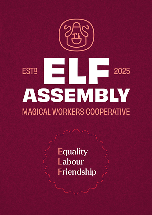
Elf Assembly Magical Workers Cooperative
Year: 2025
Click here for behind-the-scenes notes.
About the project
Project Overview
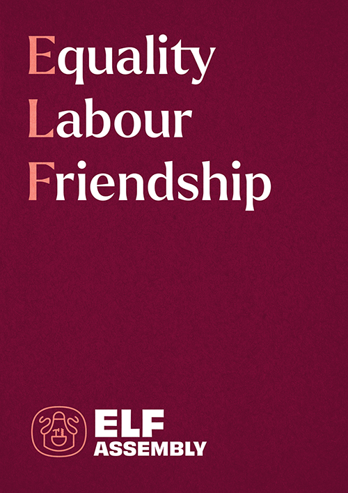
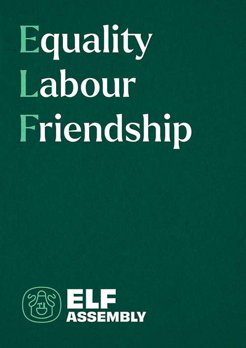
Elf Assembly is a worker-owned toy-making collective based in the North Pole. Operating as a cooperative, the organisation brings together craftspeople across multiple specialist departments, united by shared ownership, democratic governance, and pride in handmade work.
As the organisation evolved, Elf Assembly required a clearer brand position and visual system to articulate its values, structure, and ways of working. The brief was to develop an identity that could balance long-standing traditions with a more contemporary, transparent expression of cooperative principles.
My Role
I led the brand strategy, creative direction, and execution of the project, working closely with stakeholders across the organisation. My responsibilities included naming and positioning, defining brand values, designing the visual identity system, creating illustrative assets, and designing and building the website.
The work required aligning cultural, operational, and visual considerations into a coherent system that could scale across internal communications, public-facing content, and digital platforms.
Naming and positioning
The name Elf Assembly was chosen to reflect both the collective nature of the organisation and its focus on making. “Assembly” speaks to shared labour, democratic decision-making, and the physical act of constructing objects by hand.
Positioning focused on presenting Elf Assembly as a functioning cooperative rather than a seasonal novelty. Language and tone were grounded, clear, and practical, allowing the organisation’s values to come through without relying on overt folklore or humour.
Creative Direction
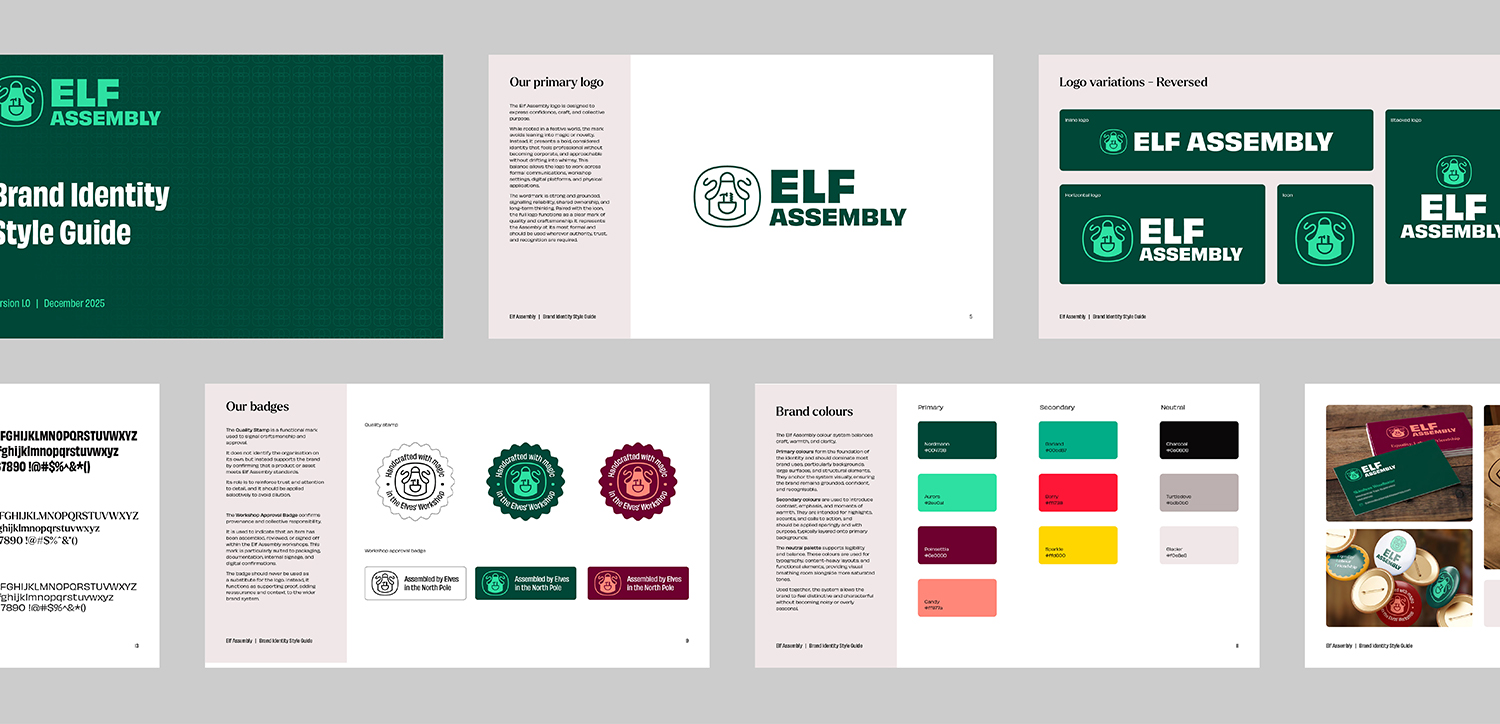
The visual identity was designed to feel warm, human, and materially grounded. Inspiration was drawn from workshop environments, traditional tools, and natural materials, helping to root the brand in craft and labour rather than fantasy.
Typography, layout, and colour systems were deliberately restrained, providing structure and consistency across applications. This approach allowed the brand to feel credible and enduring, while still retaining a sense of character and warmth.
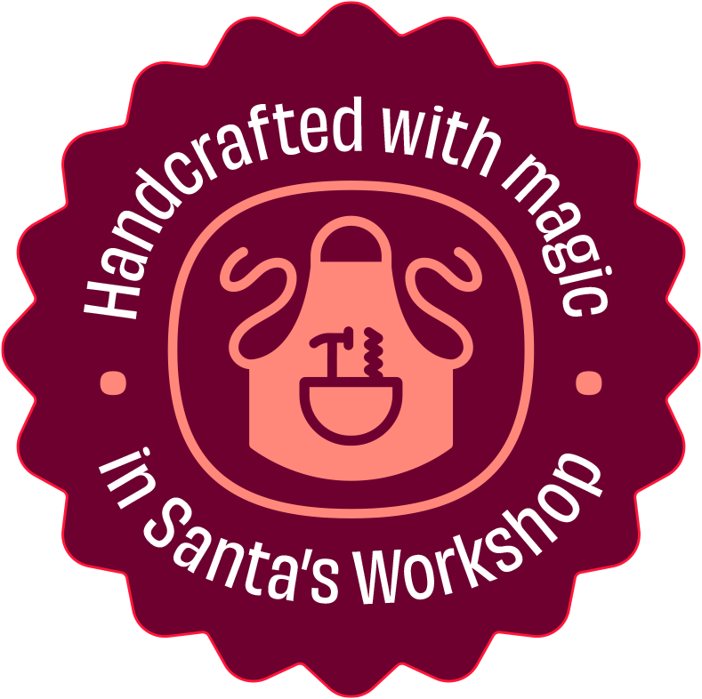
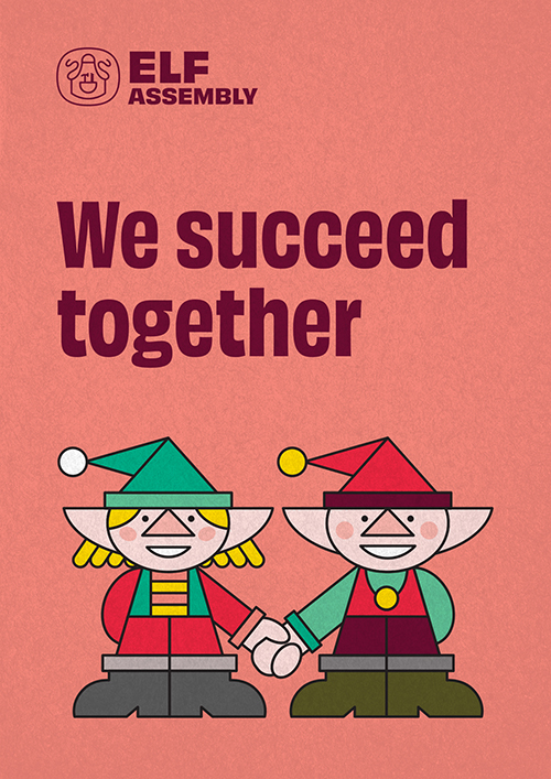
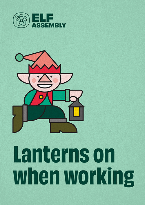
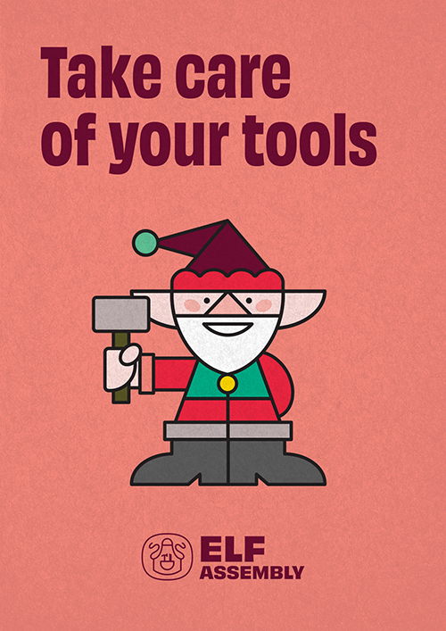
Illustration was used selectively to support internal culture and engagement. Hand-drawn elf characters were developed as workshop posters, notices, and informal communications, adding personality without competing with the core identity system.
This distinction helped maintain clarity in the primary brand while giving teams space to express culture and humour within their working environment.
Website Redevelopment
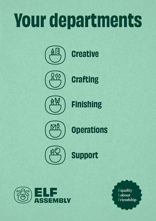
The website was designed as a central hub for the organisation, outlining its history, values, departments, and cooperative model. Content structure and navigation were informed by clarity and accessibility, ensuring information was easy to find and understand.
From a technical perspective, the site was built to be responsive, modular, and scalable, with subtle motion and layered imagery used to add depth without distracting from content.
Results
The project resulted in a cohesive brand system that clearly articulates Elf Assembly’s values and ways of working. The new identity provides a flexible foundation for internal communications, cultural initiatives, and public-facing storytelling, while the website acts as a clear and engaging digital anchor for the organisation.
Website
Business cards
Pin badges
Wax seal stamp
Behind the scenes
Elf Assembly is an openly fictional project, treated with real-world constraints.
It was created as a way to explore genuine brand questions without a live commercial brief, while still demanding clear, defensible decisions.
Several deliberate tensions shaped the work.
The balance between socialist values and seasonal mythology. Naming something that felt credible rather than cute. Deciding when ideas added charm, and when they distracted from clarity.
Not everything belonged in the core identity.
The hand-drawn elf illustrations, for example, carried warmth and personality, but did not strengthen the main visual system. Rather than forcing them into the brand, they were repositioned as internal workshop posters and cultural artefacts, reflecting how real organisations separate formal identity from informal expression.
The project also functioned as a technical and creative testbed.
Website layout, motion, content structure, and front-end execution were all treated with the same rigour as client work. The brief may have been fictional, but the standards were not.
I am documenting the full design process in a multi-part blog series, framed explicitly as work for a fictional client, covering strategy, naming, visual development, and execution.