This is part four of a series of posts covering the Elf Assembly branding project:
- Part one: No elf control | Designing a Christmas Brand
- Part two: What’s in a name? Everything, actually
- Part three: Decisions, dead ends, and direction changes
There was a clear moment when Elf Assembly stopped being a design project and became an exercise in delivery. Once the brand guidelines were locked and my focus shifted almost entirely to the website, the work changed pace. Exploration gave way to execution. Every decision now had a direct consequence in terms of time, scope, and viability. From that point on, the question was no longer what could this be? but what does this need to be in order to launch?
The website became the non-negotiable.
It needed to feel fully realised, not just visually, but structurally. No dead ends. No placeholder pages. Complete navigation. SEO in place. Content that could stand up to a reasonable level of scrutiny. If the site felt thin or unfinished, the entire premise of the project could collapse.
Alongside that, the social launch posts were essential. Without them, the project would exist in isolation. The launch was not an afterthought, it was part of the work. Everything else became optional by comparison.
What didn’t get assembled
The biggest cut back in deliverables came from the internal-facing elements.
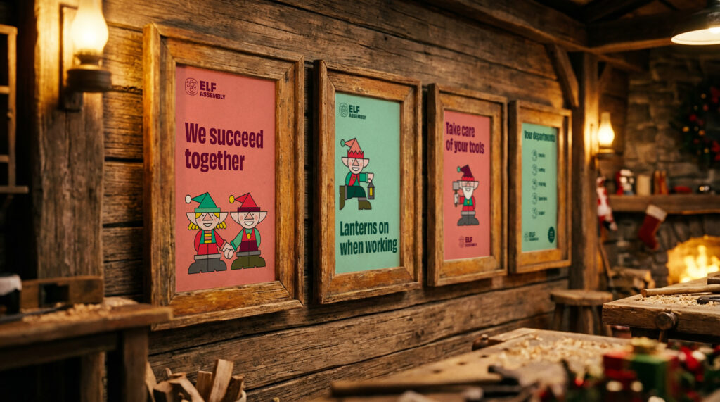
Earlier plans had included wider use of the elf characters across badges, posters, workbooks, and merchandise mockups. In reality, most of that work never happened. The characters were eventually limited to a small set of poster designs, where they could exist without undermining the more grounded tone of the public-facing brand.
This was not a creative decision so much as a practical one. But with the very tight dealine (and Christmas looming) something had to give.
One of the more unexpected challenges was the sheer effort that the website demanded.
What I initially assumed could be handled within a relatively small number of pages quickly expanded. The ideas I wanted to communicate, around structure, values, departments, and realism, needed space. Content that felt cramped on a single page had to be broken out into dedicated sections.
Each new page brought knock-on effects. New visuals. More internal linking. Additional SEO work. More time. The site wasn’t becoming complicated for the sake of it. It was growing out of necessity but that came at a cost.
Decisions made because of time constraints
Several compromises were made purely to meet the deadline. I had intended to publish all of the process blog posts alongside the launch. Those were pushed back. I wanted to revisit and refine some of the AI-generated imagery to bring it closer to my original vision. That didn’t happen. The images were good enough for the purpose of the project, even if they weren’t ideal.
The most obvious shortcut was the Members section on the site. Originally planned as a detailed area covering membership, roles, training, and benefits, it was reduced to a login page. The link remained in the navigation because it supported the realism of the organisation, but the depth was deferred.
None of these decisions were satisfying, but all of them were defensible. Ultimatley, I needed to know when to stop…
I launched once the website reached a baseline I was comfortable standing behind. It was visually coherent. It met basic accessibility expectations. The SEO foundations were in place. At that point, continued tinkering was no longer improving the project in any meaningful way. I don’t think I was ever emotionally finished with it. But I was confident enough to go live.
Launching (finally)
The overwhelming feeling at launch was relief. The project had grown larger and more consuming than I had anticipated, and pressing publish lifted a weight. I was pleased with the outcome, even though it fell short of the original, idealised version I had imagined at the start.
The response helped. The feedback was genuinely positive, and that external perspective compensated for some of my own perceived shortcomings. It reminded me that projects do not need to be perfect to be effective.
More than anything, the final stretch tested my discipline. It tested my ability to build a functional, visually coherent website quickly. It tested my willingness to adjust expectations and make peace with compromise. It tested my confidence in deciding what mattered most under pressure.
The launch left me with a simple question: was it worth it? And really, the answer is yes.
The project taught me a lot about working for myself, managing my own expectations, and understanding how I perform when the pressure is real and self-imposed. Once again, it reinforced something I’ve learned repeatedly over the years. The most demanding projects often lead to the most rewarding outcomes, even when they take you somewhere slightly different from where you expected to end up.