RallyFit app
Project areas
- Brand strategy
- Logo design
- Visual identity
- Brand style guide
About the project
Project Overview
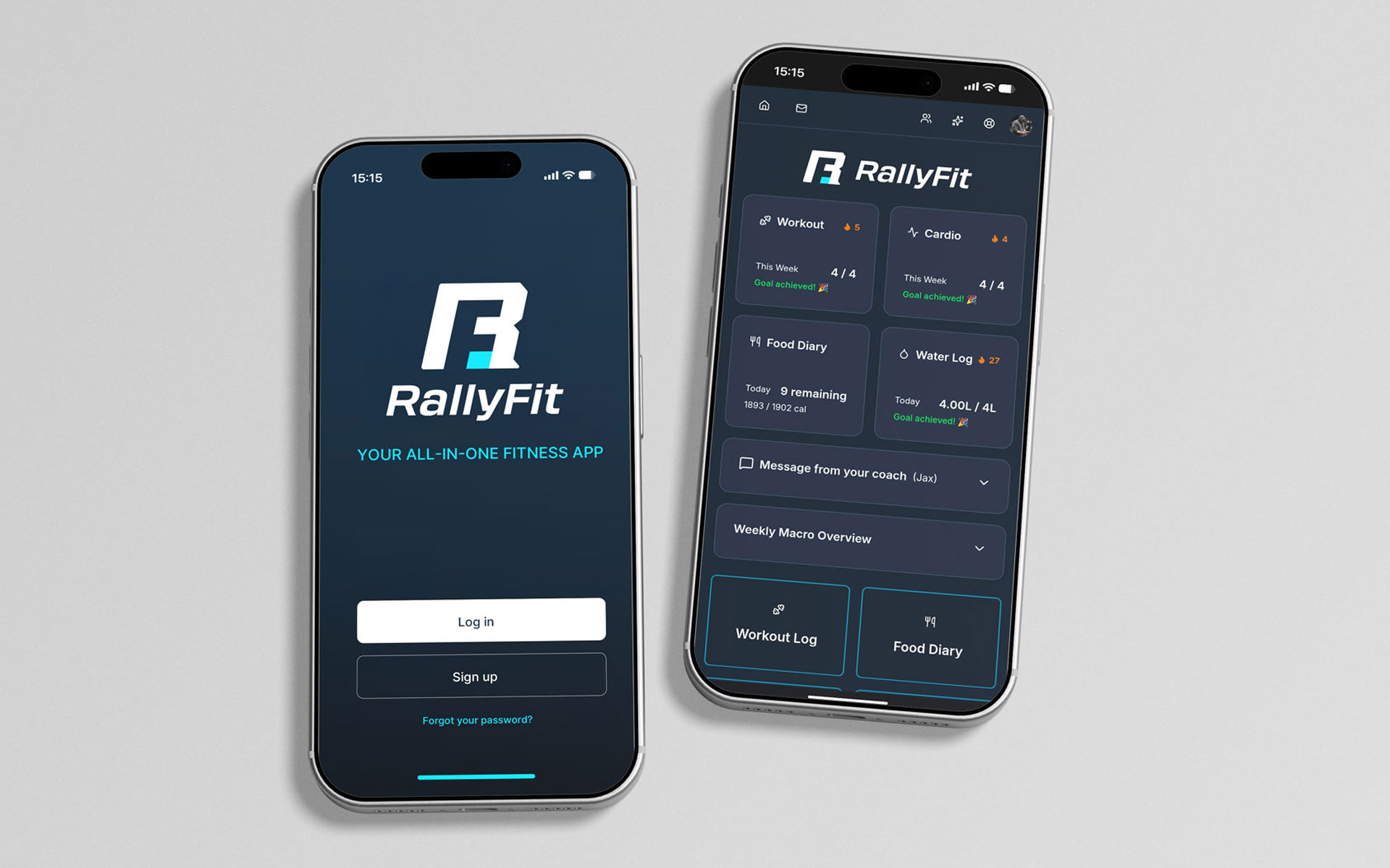
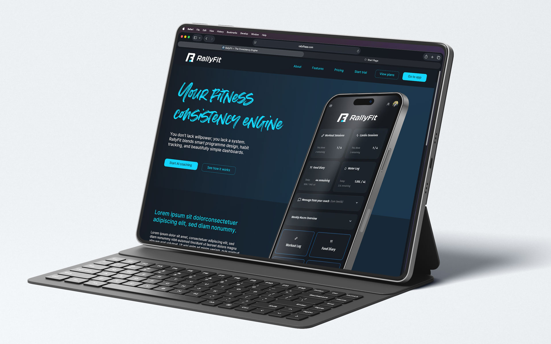
RallyFit is a digital fitness platform designed to combine structured programme design, habit tracking, and intelligent coaching within a clean interface. The business required a visual identity that could feel modern and technical without becoming cold or aggressive. The brand needed to sit comfortably within a dark, product-led environment while still conveying energy and momentum.
The objective of the project was to create a distinctive logo and supporting visual system that would scale across app, web, and marketing touchpoints, while reinforcing RallyFit’s core proposition: structured performance, guided by intelligent coaching.
My Role
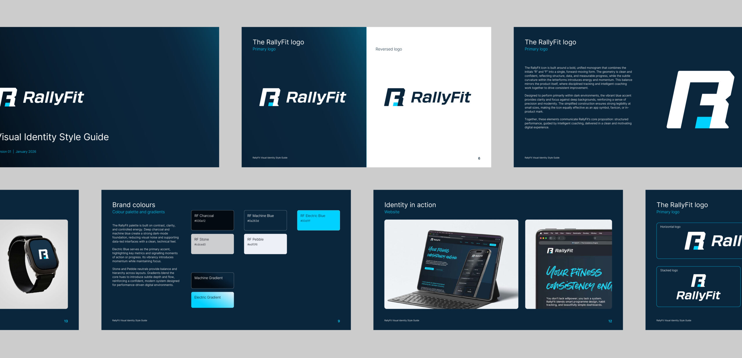
I led the identity development from initial positioning through to final documentation. This included defining the brand’s visual tone, designing the core logo and monogram, establishing the colour palette and gradients, and selecting a typography system. The work culminated in a concise visual identity style guide, outlining logo usage, colour hierarchy, and typographic structure to ensure consistent use across product and marketing channels.
Creative Approach
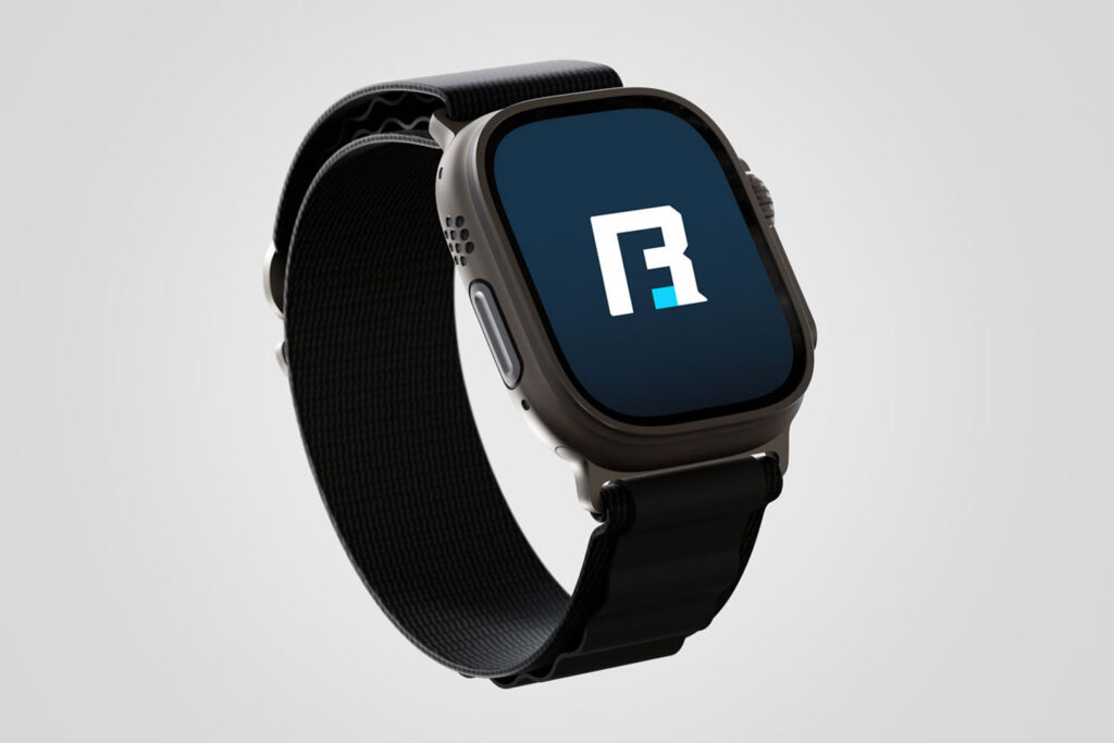
The RallyFit icon is built around a unified “R” and “F” monogram, constructed as a single forward-moving form. The geometry is clean and confident, reflecting data, structure, and measurable progress, while subtle curvature introduces a sense of energy and motion.
The colour palette centres on deep charcoal and machine blue to create a focused dark-mode foundation. Electric Blue acts as a high-contrast accent, highlighting key metrics and signalling moments of action. Neutral tones introduce balance and hierarchy, while gradients add depth. The typography pairs a functional, highly legible sans-serif with a more expressive accent face for motivational messaging. This balance mirrors the product itself, disciplined tracking supported by motivating guidance.
Results
The project delivered a simple but cohesive and scalable identity. The logo performs clearly at small sizes, making it effective across app icons, splash screens, and interface components. With a defined visual system in place, RallyFit now has a confident brand foundation that supports product clarity, reinforces its positioning as a performance tool rather than a lifestyle brand, and provides the flexibility to grow as the platform evolves.