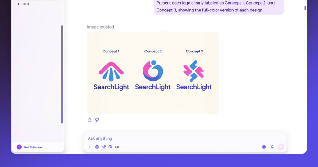
Throughout my career, I’ve been involved in a number of ‘logo only’ projects. Some of these have been for new start-ups who are very cost conscious, and are sceptical about spending money on anything that isn’t absolutely essential. So they get the logo designed, and leave it at that, perhaps hoping to invest more in the identity once they’ve seen some financial success.
Other projects have been for clients who think that a logo is all they need. Or at least, all they need to pay for. The rest they can do themselves. This is a bit like going to the hairdresser, and paying them to trim your fringe. Then going home and cutting the rest of your hair by yourself.
A logo is not an identity on its own. It exists within a broader design ecosystem. A potential customer might encounter your brand in several places before ever speaking to anyone. Your website, social posts, sales collateral, marketing materials, event booths, email newsletters; each of these are small moments of interaction with your brand. When they are coherently designed and connected, the brand begins to feel familiar. If they look disconnected, you risk undermining both your recognisability and your credibility.
Just the fringe
Imagine two scenarios for a company and its branded collateral.
The first example has different colours across its materials depending on who created them. Typography varies from presentation to presentation. Social posts look unrelated to the website. Sales documents feel like they belong to a different organisation entirely.
The logo is present in every piece of communication, but it doesn’t help to unify the experience.
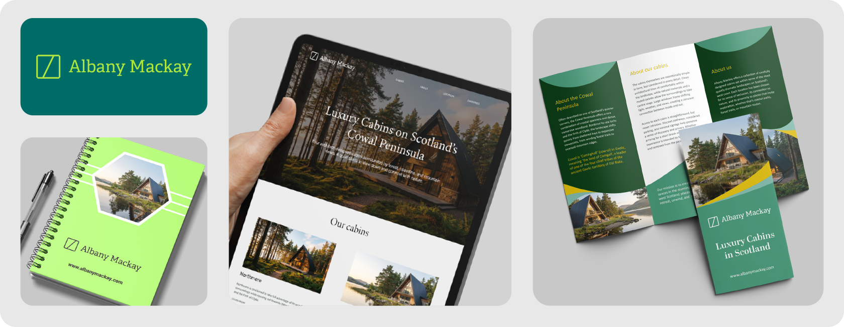
A full wash, cut, and blow dry
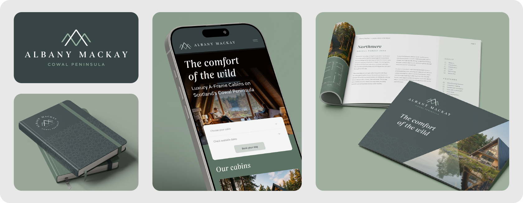
In the second scenario, the company uses their logo within a defined visual system. The colour palette is applied consistently. The typography is clearly structured. The layout styles are recognisable. The graphics and images follow the same visual language. And the logo adapts across all of these formats without losing recognisability. Even before reading the content, the materials feel connected.
The difference between these two examples is not the quality of the logo. It is the presence, or absence, of a visual identity system.
Why consistency matters
Consistency is often misunderstood as a purely aesthetic concern. In reality it serves two very practical purposes.
Recognition
The more consistently a brand presents itself, the easier it becomes for people to recognise it. Over time the colours, typography and layouts become familiar. This recognition reduces friction. People understand who they are interacting with more quickly.
Trust
Inconsistent brands can unintentionally signal disorganisation. If the website, marketing materials and social content all look unrelated, it can raise small doubts about the company behind them. Those doubts may not always be conscious, but they still influence perception.
A coherent visual identity helps communicate that the organisation is structured and considered in how it presents itself.
Building an identity that matters
So, how do you avoid looking mismatched? How do you prevent a fragmented visual identity? By investing in more than just a logo. A robust style guide document, branded social and presentation templates, asset library of styled images and graphics. These are all vital elements of any identity project, and as essential as the logo itself. They make it easier for teams to create new material while maintaining consistency.
Investing in these is key to building a brand identity that resonates with customers, builds equity and trust, and ultimately drives growth.