AstraMesa visual identity
Project areas
- Brand strategy
- Logo design
- Visual identity
- Brand style guide
About the project
Project Overview
AstraMesa is a UK-based CTO-as-a-Service consultancy providing embedded technical leadership to growing businesses. Rather than operating as a traditional external consultancy, AstraMesa works alongside engineering teams, helping organisations navigate technical challenges, improve delivery, and scale with confidence.
The business required a visual identity that could communicate experience, credibility, and technical precision while avoiding the generic visual language often associated with technology consultancies. The identity needed to feel modern and distinctive, reflecting both the strategic nature of the service and the collaborative way it is delivered.
The objective of the project was to create a memorable logo and supporting visual system that captured the idea of embedded leadership, while providing a flexible foundation for digital, marketing, and business development activities.
My Role
I led the project from initial discovery through to final delivery. This included defining the visual direction, developing multiple creative territories, designing the logo and custom wordmark, establishing the colour palette and typography system, and documenting the final identity within a comprehensive visual style guide.
The process began with a series of exploratory mood boards covering themes of structure, vision, tension, and retro-digital aesthetics. These explorations helped identify a direction that balanced geometric simplicity, bold colour, and strong standalone brand recognition.
Creative Approach
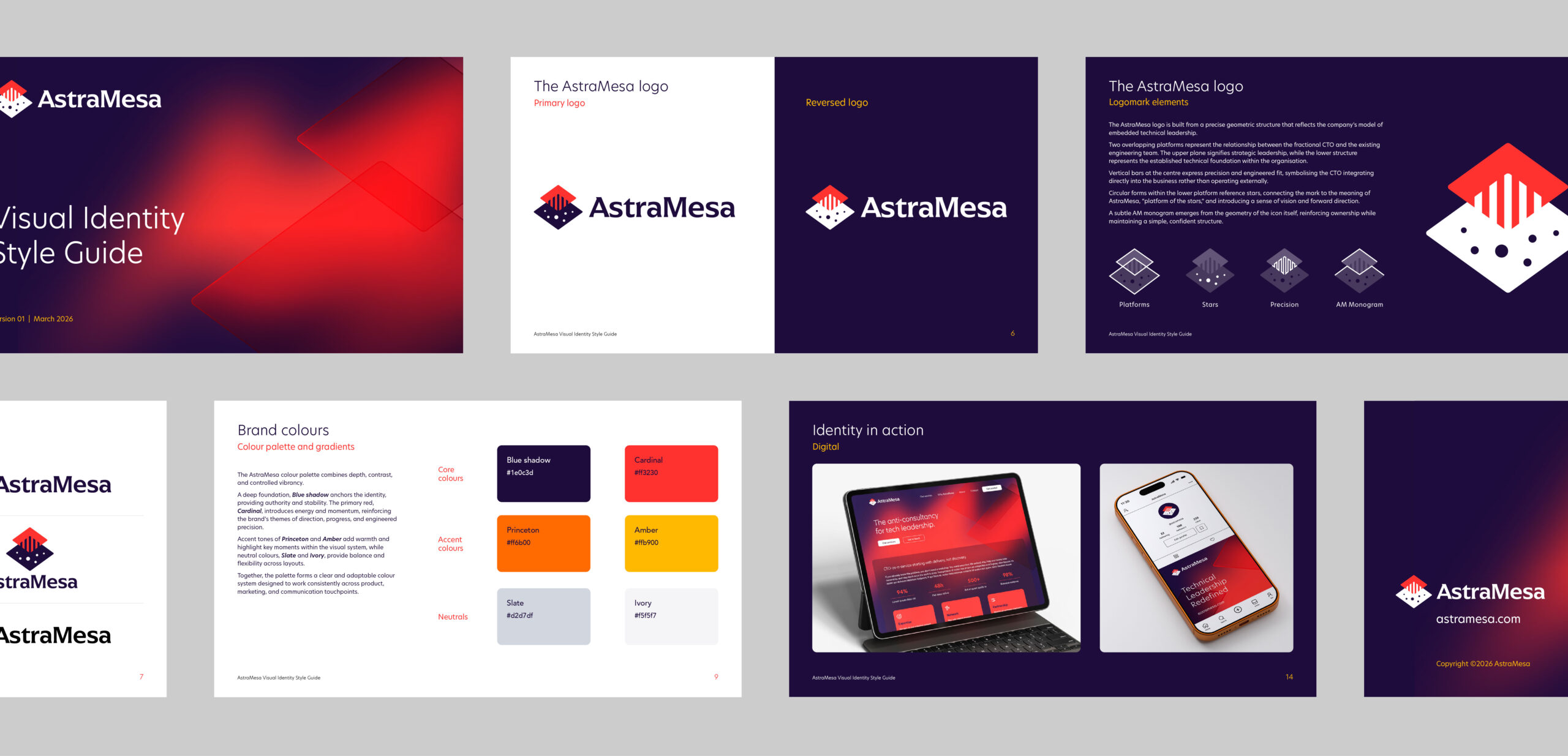
The final identity centres on a geometric icon constructed from two overlapping platforms. The upper plane represents strategic technical leadership, while the lower structure signifies the established engineering foundation within the client organisation. Together, the forms express alignment, collaboration, and integration rather than oversight.
Vertical bars at the centre of the mark symbolise precision and engineered fit, reflecting the role of a fractional CTO working directly within a business. Circular forms within the lower platform reference stars, connecting the identity to the meaning behind the AstraMesa name: “platform of the stars”. A subtle AM monogram is embedded within the geometry, reinforcing ownership while maintaining simplicity.
The colour palette combines a deep blue-violet foundation with vibrant reds, warm orange accents, and neutral tones. The result balances authority with energy, while atmospheric gradients introduce a subtle sense of horizon, ascent, and exploration. Typography pairs a highly legible sans-serif with a customised wordmark, creating a system that feels confident, modern, and technically assured.
Results
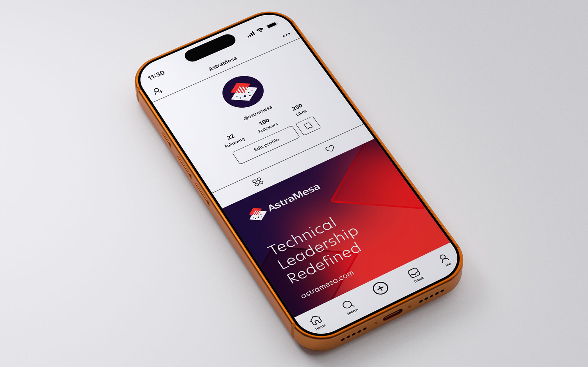
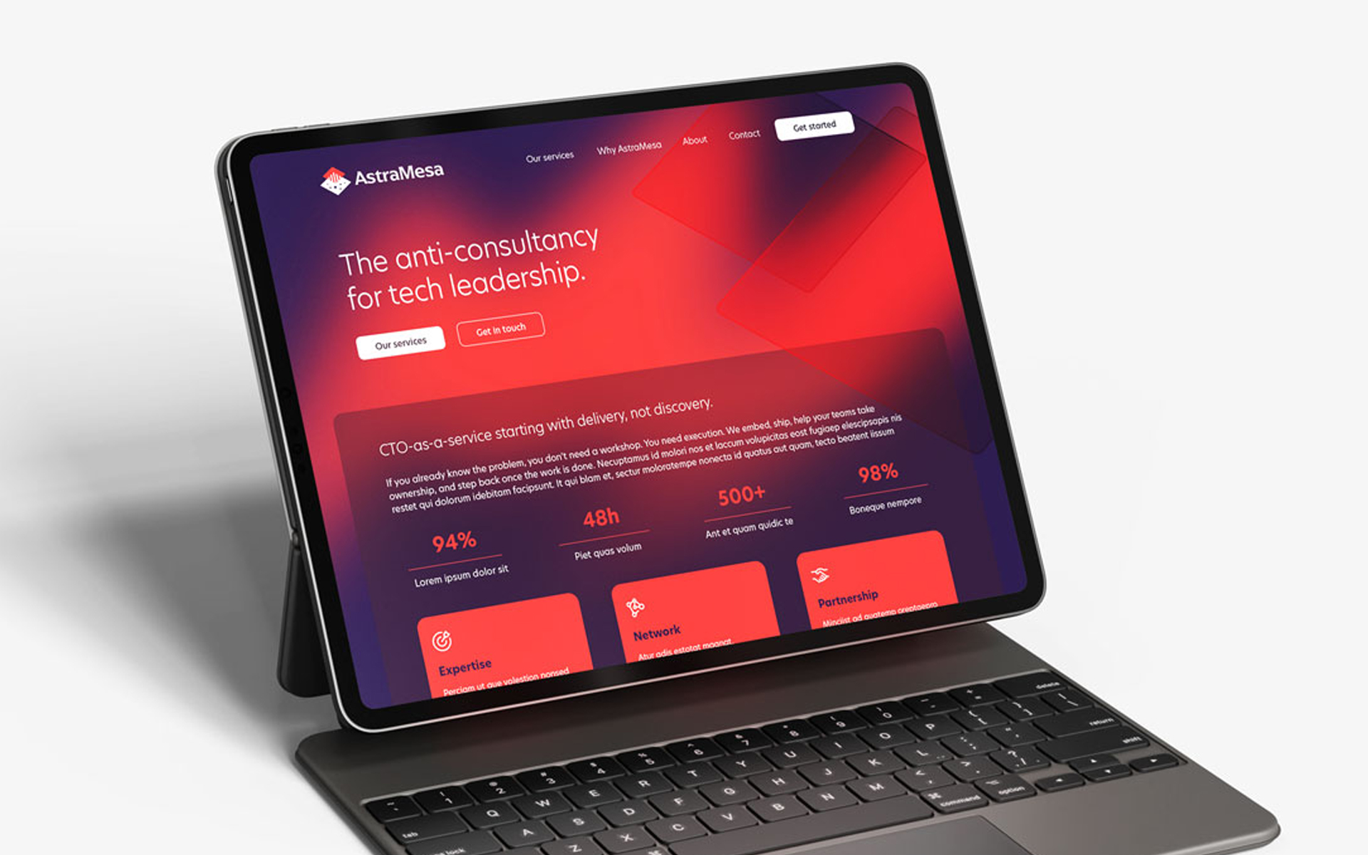
The project delivered a distinctive and scalable identity system that clearly communicates AstraMesa’s positioning as an embedded technical leadership partner. The logo performs effectively across digital and print applications, from social media and presentation decks to business stationery and web interfaces.
By grounding the identity in the company’s service model and name meaning, the brand achieves a balance between technical precision and aspirational thinking. AstraMesa now has a cohesive visual foundation that supports credibility, differentiation, and future growth.