The sign below has always bothered me. And I’m not just saying that as a useful hook for a blog post. I have genuinely been irked by the illustration choices on this for years, along with a number of other UK signs.
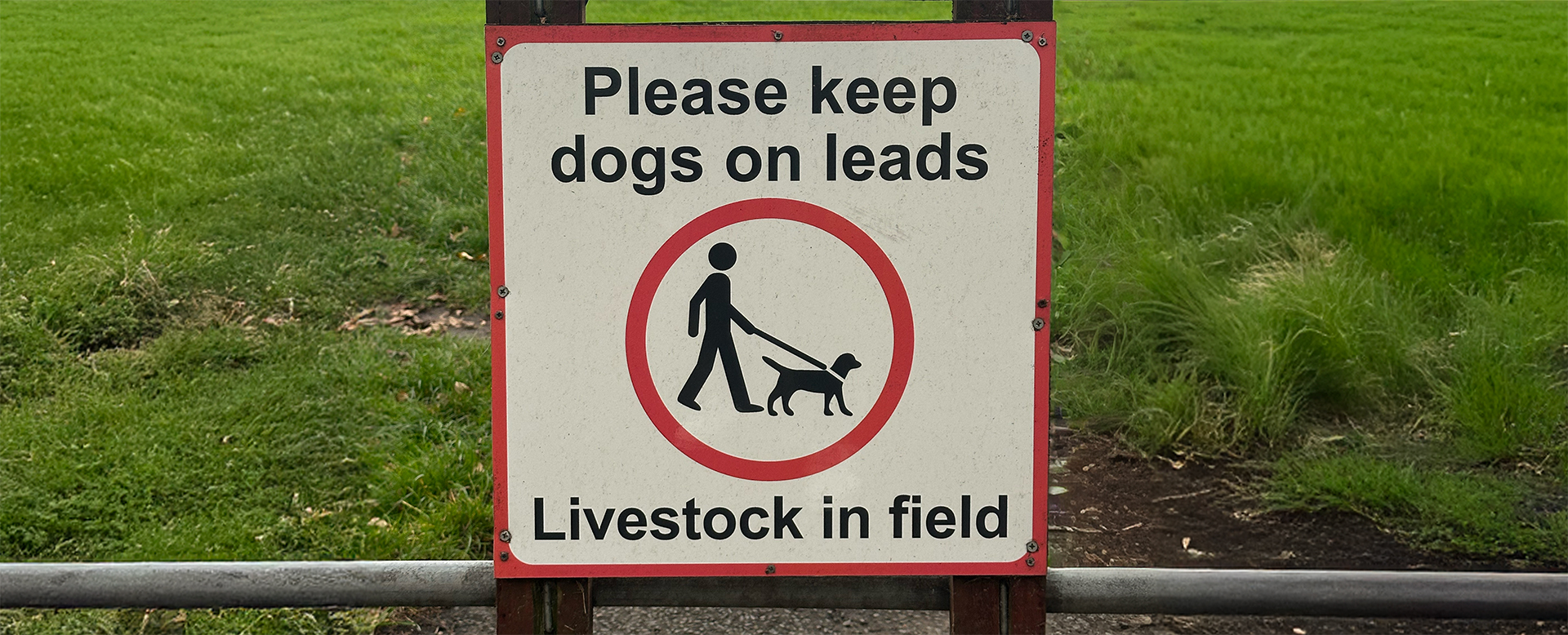
I understand the logic of the ubiquitous stick figure. It’s a reductionist stand-in for a human; simple, easy to recognise, and appropriate for signage. But then on this sign, the floating bobble-headed character is partnered with a dog that is, for the most part, anatomically correct. Why? Surely the dogs’ head should be a levitating sphere too? And it legs should be equally stick-ish. The same visual logic should be applied consistently. Instead, two different illustrative approaches collide in a single visual.
To be clear, I’m aware this is very much a designer’s quibble (and perhaps limited to just this designer). I don’t expect anyone else to have seen this sign and shaken their fist and shouted “Inconsistent proportions! Damn you UK government signage agency!” But I have (at least internally).
The last time I spotted it, it prompted a reflection on consistency in design but on a broader scale, not just the OCD of a middle-aged designer walking his dog…
Why does this matter?
Having led design teams for much of my career, one principle I’ve always returned to is the importance of consistency when building visual identities and design systems. That means ensuring photography aligns in lighting, composition, colour balance, and tone. It means choosing iconography that matches in line weight, scale, and brush style.
These details matter because they create a coherent visual language, one that makes a brand easier to recognise. This coherence also builds a level or trust in the viewer, as it subconsciously signals care, attention to detail, and a professional approach to the way the brand presents itself. Like wearing a smart suit with matching ties and shoes to an important meeting, rather than a cable-knit sweater, cargo shorts and slippers.
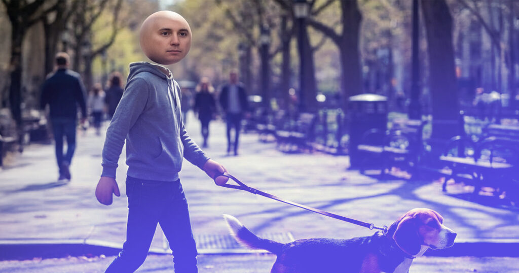
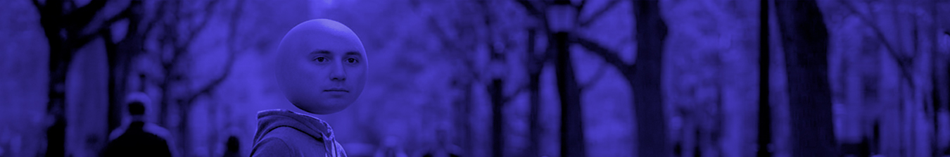
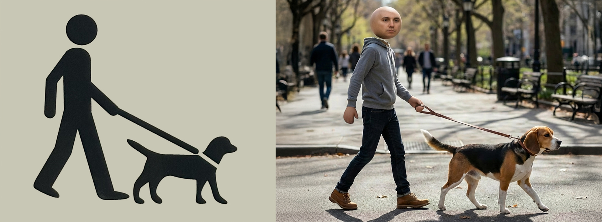
For fun, and to really push the analogy, I mocked up a real-world version of the figure walking its dog and placed it alongside the original sign. Seeing it rendered this way makes the issue harder to ignore. Both elements are acceptable on their own (even the fella’s floating head), but together they feel wrong. The problem isn’t the execution or realism, it’s that they’re operating under different rules. They disconnect, visually and conceptually, because they were never designed to belong to the same system.
That, ultimately, is the risk of inconsistency in visual identity design. It’s rarely obvious as a clear failure and will usually go unnoticed by the viewer, at least consciously. More often, it creates a vague sense that something feels off. A brand that looks slightly improvised. A system that never quite comes together. An impression that decisions were made independently, rather than as part of a whole.
Consistency is not about rigid uniformity or stripping out personality. It’s about commitment. And harmony. Choosing a visual logic and applying it intentionally and with care. When that logic holds, a brand feels confident and deliberate. When it doesn’t, you get something like that sign: well-meaning, almost there, but undermined by its own contradictions.
And once you start noticing it, whether on a park fence or in a brand system, it’s very difficult to ignore.