This is part three of a series of posts covering the Elf Assembly branding project:
- Part one: No elf control | Designing a Christmas Brand
- Part two: What’s in a name? Everything, actually
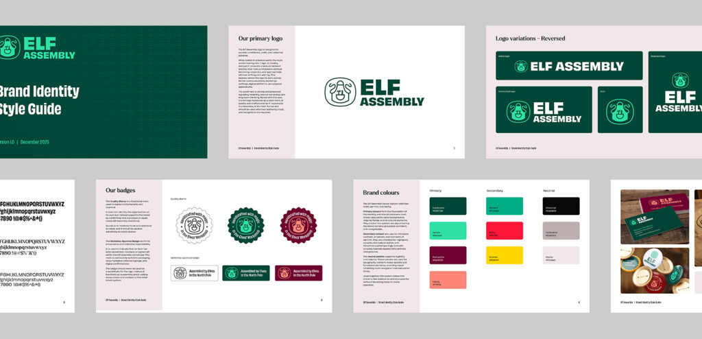
I began, as I often do on such projects, with the logo. From the outset, I knew I wanted a strong wordmark supported by a secondary mark that could function as a quality seal, something that could plausibly appear stamped on toys or workshop materials. The idea of a workshop apron emerged almost immediately as the core motif, with the ties forming a decorative frame around the mark.
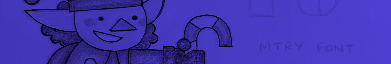
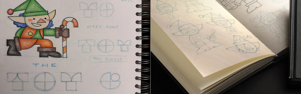
At the same time, I was sketching elf characters. Early on, I assumed they would play a central role in the branding. They seemed like the most direct way to communicate the mythology and the Christmas setting. That assumption didn’t last.
Early routes and abandoned elves
Before the name shifted to Elf Assembly, I explored logo ideas built from toy blocks, with the lettering itself formed from modular components. There was something appealing in that approach, particularly its literal connection to making and assembly. Once the name changed, however, that direction lost its relevance and was quietly dropped. The elf illustrations persisted much longer.
Initially, they felt like a strong solution. They clearly communicated the subject matter and allowed me to introduce folklore and humour without relying on festive clichés. But once work began on the website, the cracks started to show. The illustrations were too cartoonish to sit comfortably at the heart of the brand. More importantly, they undermined the grounded, naturalistic tone that was emerging elsewhere in the work.
It became clear that if the brand was to feel real, the elves couldn’t be front and centre.
Defining the tone properly
From early on, I wanted the brand to be serious in its execution, even if the premise was playful. The goal was not to hide the mythology, but to let it sit quietly beneath the surface. I was drawn to the boldness and confidence of mid-20th-century socialist graphic design; bold typography, limited colour palettes, and a sense of purpose, but without tipping into aggression.
That tonal ambition helped clarify other decisions.
Rather than leaning into illustrated characters, the brand shifted towards more realistic imagery of workshops and village interiors. Warm lighting, wood, tools, and working spaces became the visual foundation. These scenes, created using AI, supported the idea of craft and labour far more appropriately than the character illustrations could. The elves were repositioned as a secondary visual layer, used sparingly in internal communications and employee-facing materials rather than as a public-facing device. That change brought the whole system into focus.
From visuals to system
The point at which this stopped being a collection of ideas and started becoming a brand was the completion of the guidelines. Although this overlapped heavily with the website build, locking down the core parameters, typography, colour, imagery, tone, and structure marked a clear shift. From that stage onwards, I was no longer exploring. I was implementing.
Decisions became easier to test and defend because there was now a framework to align to. That sense of coherence carried through into the website, which had grown into a much larger part of the project than I initially expected.
Constraints at work
The biggest constraint throughout the project was time.
Between the brand work itself, the website, and the supporting social and blog content for launch, everything had to be delivered in under 20 days. That pressure forced prioritisation, sometimes uncomfortably so. It also exposed where my process could have been tighter earlier on. The exploratory phase ran longer than it should have, which meant the delivery phase became compressed towards the end. That imbalance is something I would address differently next time.
A conscious compromise
Despite the overall cohesion of the final brand, I still see the hero imagery as its weakest element. It functions well enough and supports the website structurally, but it lacks the distinctiveness and consistency I would ideally want. That is partly a reflection of my current experience level with generative AI tools.
If I revisit this project in the future, that is the area I would most want to improve, with better prompts, more control, and a clearer visual benchmark.
What this stage reinforced
This phase reinforced something I already suspected about how I work.
I perform best when faced with a clear, imminent deadline. The pressure sharpens decision-making and reduces unnecessary exploration. What this project highlighted, though, is the importance of mapping milestones more deliberately at the outset, so that momentum is distributed more evenly rather than concentrated at the end.
The next challenge wasn’t design. It was finishing.