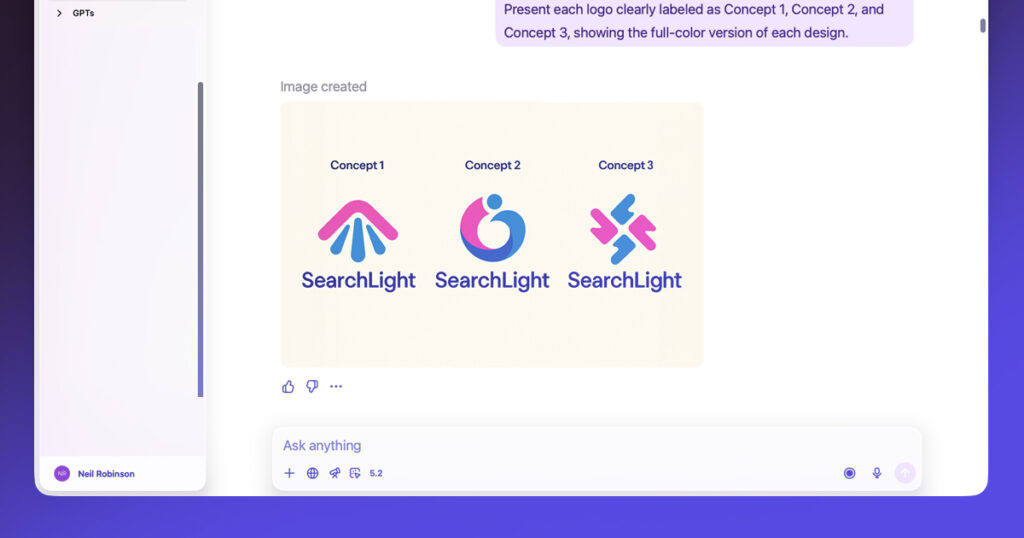
This is part two of a series of posts covering the Elf Assembly branding project:
Naming turned out to be one of the more time-consuming parts of this project. Because Elf Assembly was conceived as a fictional organisation treated as real, the name needed to establish credibility quickly. It had to hint at humour without tipping into parody, and support deeper ideas around labour, craft, and collective ownership without spelling them out.
For a long time, I was convinced the name would be The Toy Assembly.
It had a clear dual meaning. Toys being assembled, and workers assembling. It felt practical, slightly industrial, and rooted in the act of making rather than mythology. On paper, it made a lot of sense. Over time, though, it began to feel like it was sidestepping the very thing that made the project distinctive.
Narrowing the field
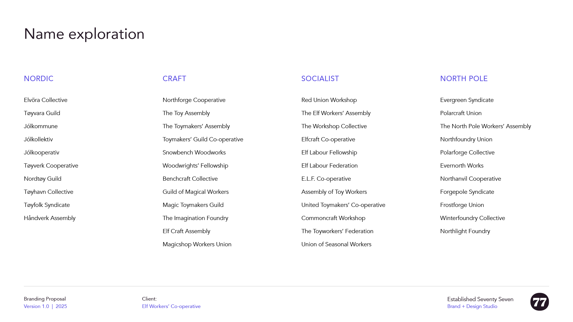
I explored a wide range of options, from folklore-led and Nordic-influenced names through to guilds, unions, and co-operative structures. That breadth helped clarify what I didn’t want just as much as what I did.
Names that leaned too heavily into folklore often felt storybook. More overtly political or union-style names were too on-the-nose. Others lost the Christmas context entirely.
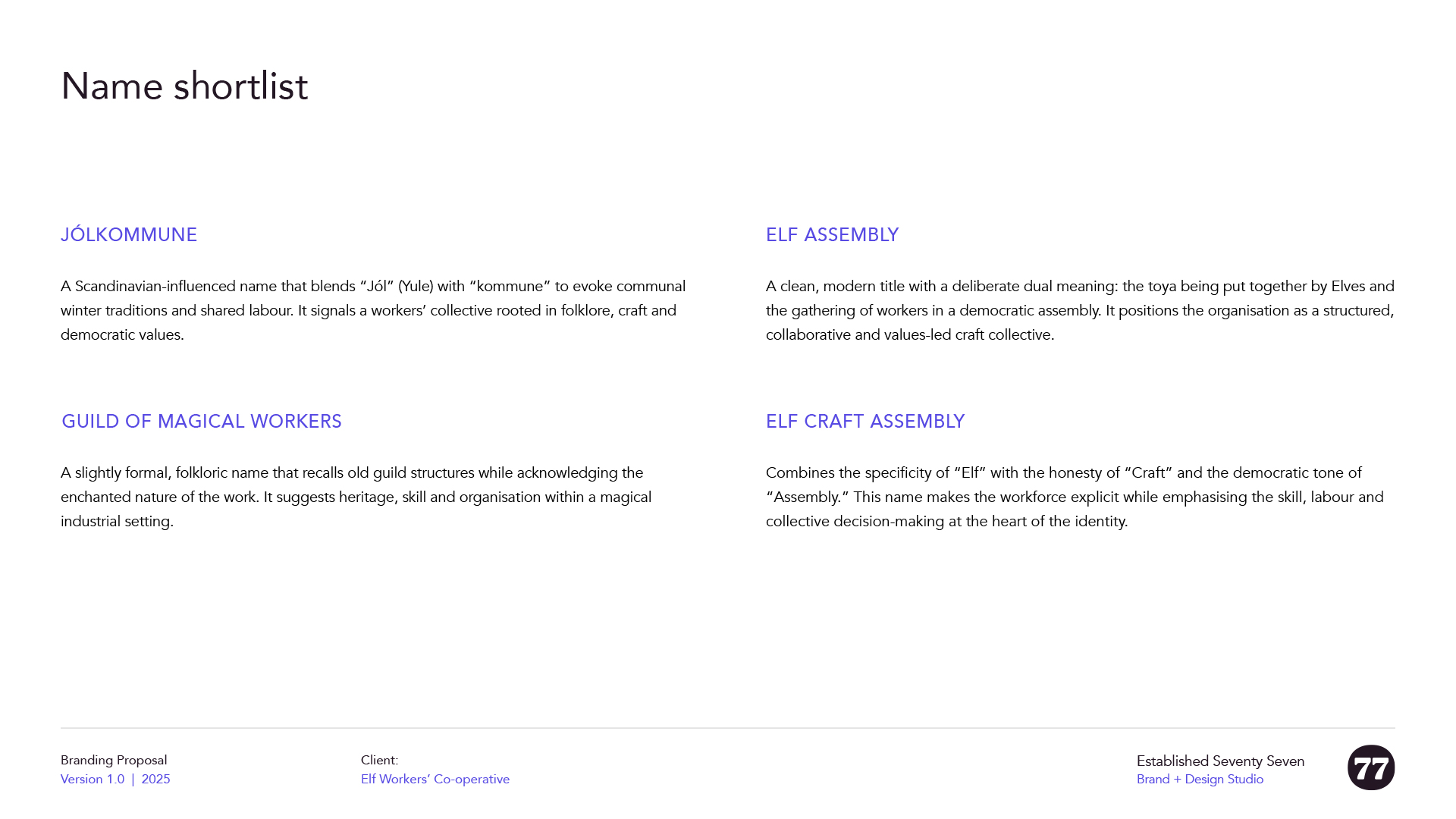
The shortlist eventually came down to Elf Assembly and Jólkommune.
Jólkommune had a strong rhythm and a pleasing Nordic feel. The inclusion of “kommune” reinforced the co-operative, socialist undercurrent of the brand, and the overall tone felt appropriate for the setting. But in the end, it asked too much of the viewer. Using a foreign-language construction I wasn’t personally fluent in felt uncomfortable, and there was a real risk of mispronunciation or it reading as gimmicky.
Elf Assembly, by contrast, was more direct.
It places the Elves at the centre of the organisation (rather the end product as with The Toy Assembly). It signals a Christmas context immediately, without novelty. “Assembly” carries connotations of buidling, gathering, and collective decision-making, all of which aligned neatly with the project’s values. There is also a subtle familiarity to it, echoing the phrase “self assembly,” which helps the name land quickly.
A light sense check showed a few small-scale uses of the name elsewhere, but nothing significant enough to cause concern, particularly for a fictional project. Once the name was locked in, everything else became easier to judge. It gave the work a clear centre of gravity, and quietly defined the boundaries of the brand.
Naming is not my area of expertise. I’ve been involved with branding projects in the past where finding the right name has been part of the process, but it’s certainly not my forte. And getting the name right is an essential part of making a visual identity work. This was a major part of my process in this project, and I was relieved to get something that felt, and sounded, right.